We’ve grown our Roots a little deeper online
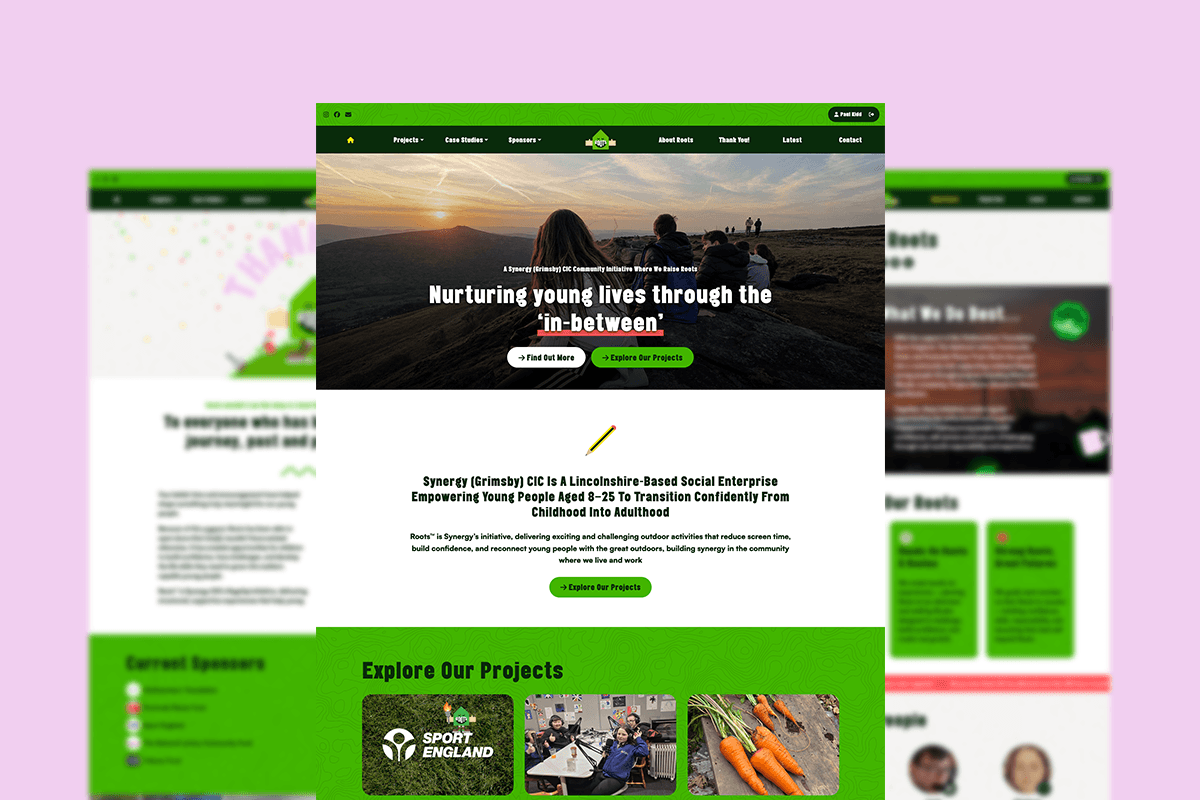
I’m incredibly proud to welcome you to raiseroots.co.uk, the brand-new online home of Synergy (Grimsby) CIC.
Our previous website had served us well, but as Synergy continued to grow, it no longer reflected who we are. We needed a website that captured our energy, celebrated our community and showcased everything that makes Synergy so special.
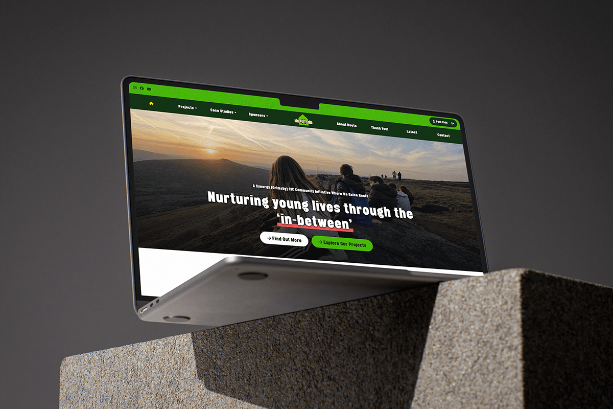
More Than Just a Website
From the very beginning, I knew this website had to be much more than somewhere to list our projects.
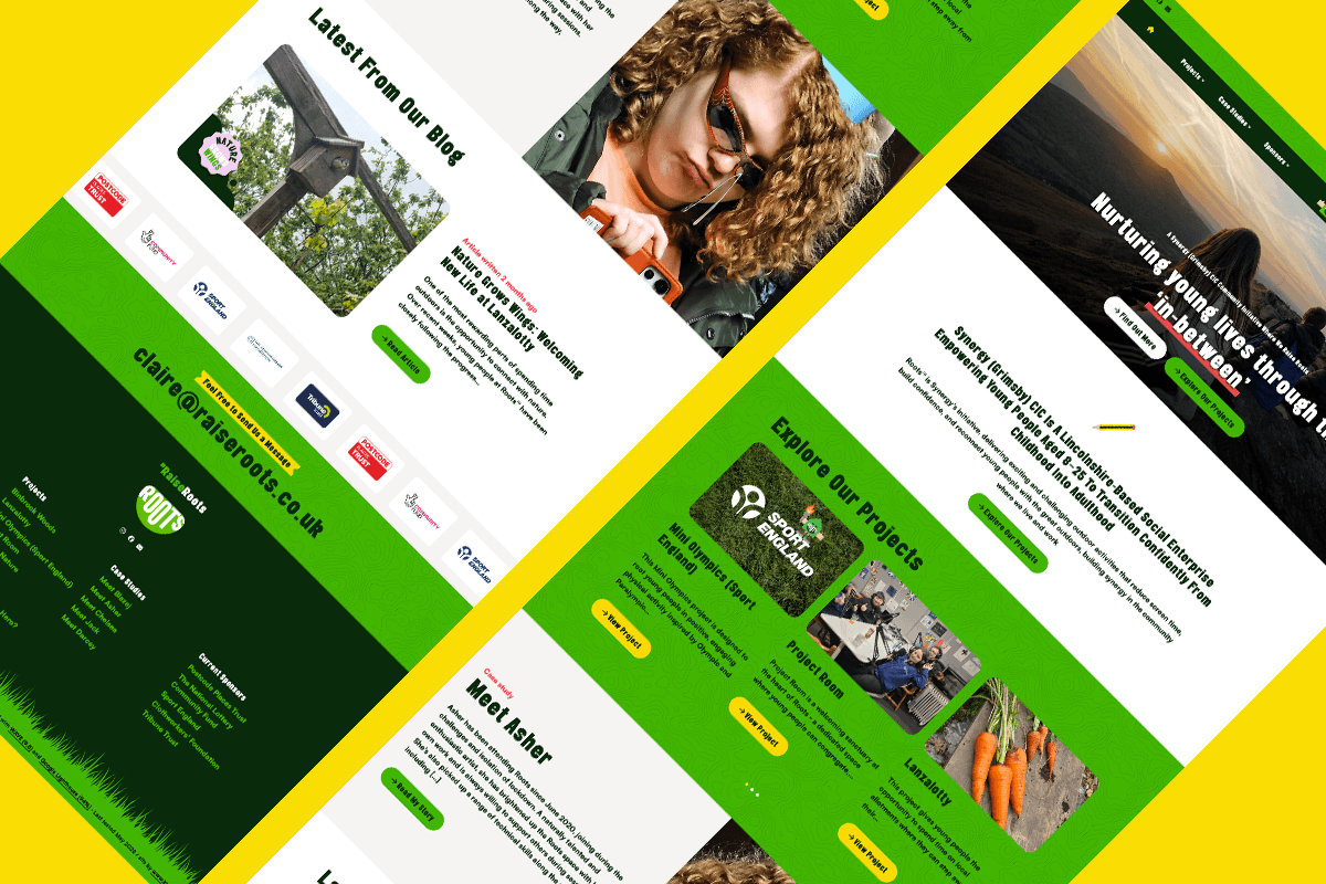
Of course, I wanted to showcase the brilliant work happening through Lanzalotty, Project Room and Routes, but more importantly, I wanted it to tell the stories of our members.
Projects bring us together, but people are what make Synergy.
One of the things I’m most proud of is watching young people grow into confident young adults. Through our member case studies, visitors will see how we’ve helped nurture confidence, develop skills and create opportunities that may never have existed without being part of the Synergy family.
The website also allows us to celebrate the amazing sponsors, supporters and partners who continue to believe in what we do. It gives us a professional platform to demonstrate our impact, strengthen future grant applications and confidently share our ambitions for the future.
Keeping It Local
When it came to creating our new identity, I was passionate about investing locally rather than outsourcing the work.
That’s why we asked Grimsby-born Paul Jamie Kidd of KidDotCo. to develop a brand that reflected Synergy’s unique personality.
I gave Paul a relatively blank canvas, but there was one clear brief: whatever we created had to be as unique as Synergy itself.
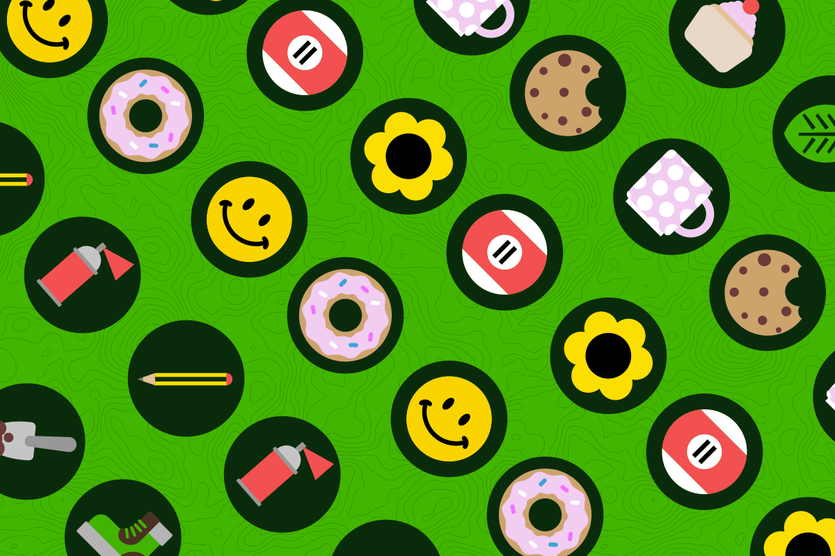
What Paul created was so much more than a logo. From the very beginning, it was a collaborative process. It was important to us that every member of Synergy had the opportunity to contribute, right down to choosing the icon that best represented them on the website.
Together, we built a complete identity for Synergy – developing the brand, colour palette, typography, illustrations, custom icon set, the much-loved illustrations, and the website itself. Built on a mobile-first WordPress CMS, the site is simple for us to manage, while the tone of voice has been carefully crafted together to ensure it feels authentic and unmistakably us.
Our organisation is wonderfully multifaceted. Our projects encourage teamwork, practical learning, creativity, confidence and the development of new skills. They also provide a safe place where members can feel valued, supported and able to access opportunities they might not otherwise have received.
…Enter Roots
After exploring a number of ideas, one word kept bringing us back…
Roots.
It seemed to capture everything.
There are the roots growing at the Lanzalotty allotment. There are the Routes we travel together on our adventures in Vimto. Most importantly, there is the way our close-knit community continues to root for one another.
We know our value. We know our worth. Together, we grow stronger.
That’s how Roots was born.
It’s a name that’s a little unexpected – roots usually stay firmly in the ground – but that’s exactly why it sticks in your mind. For us, Roots is about giving people strong foundations while helping them grow, develop and reach their full potential.
Designed for Everyone
It was important that the new brand didn’t feel too young or limited to one particular audience. We wanted something that could be appreciated by members, parents, volunteers, funders, supporters and the wider community.
Accessibility was also a priority throughout the project. We wanted our website to be welcoming, inclusive and easy to navigate for everyone.
Inclusion shouldn’t stop with our projects – it should be reflected in our digital spaces too.
Meet Roots
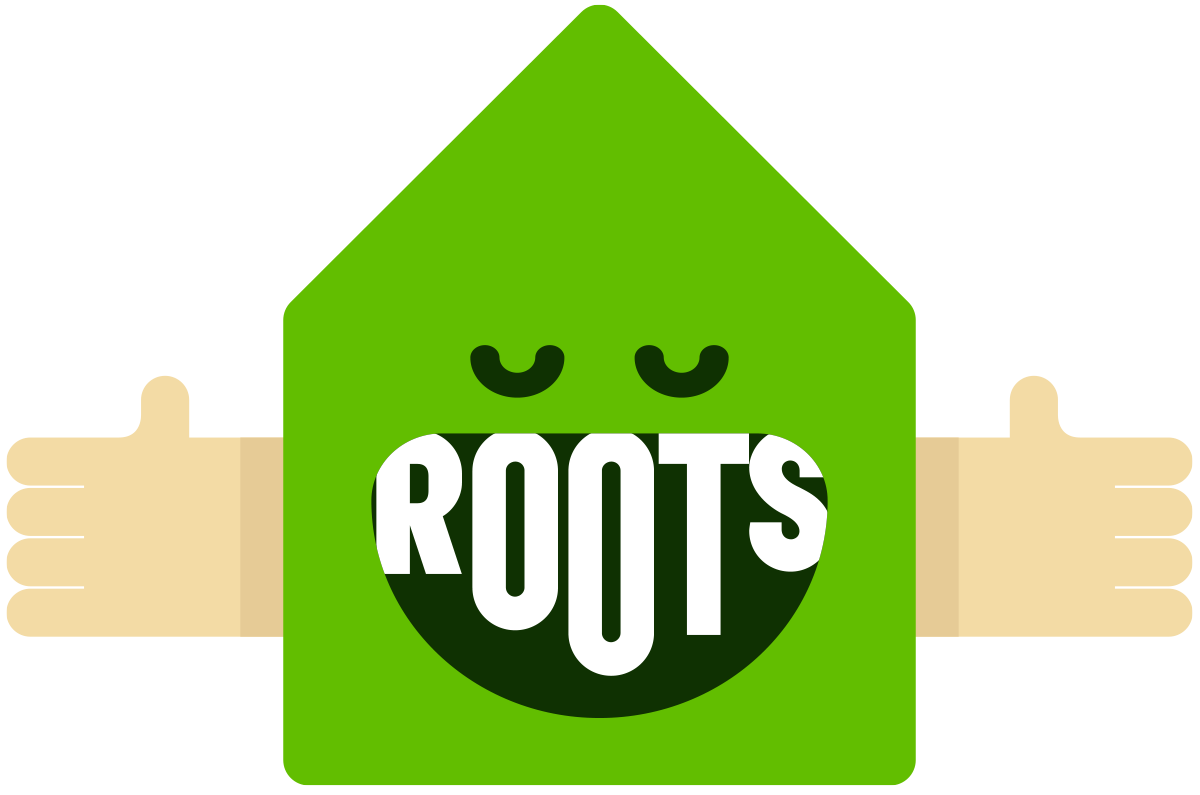
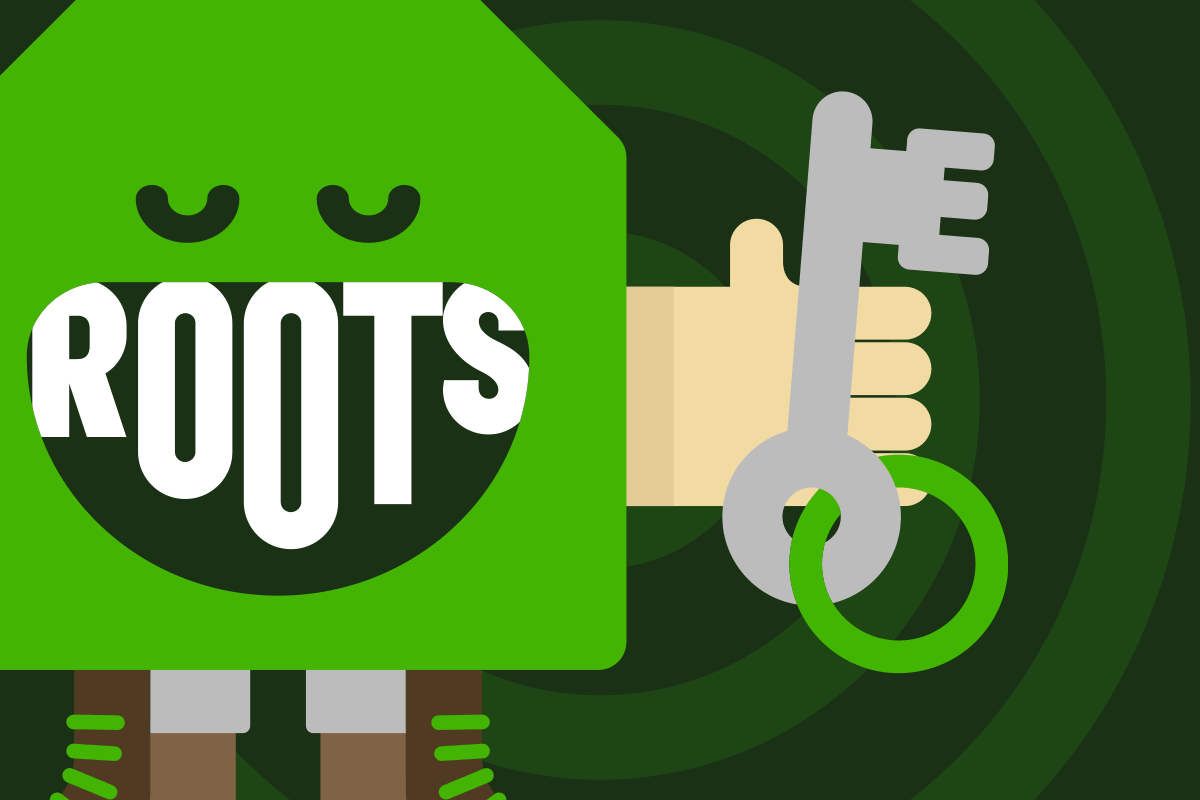
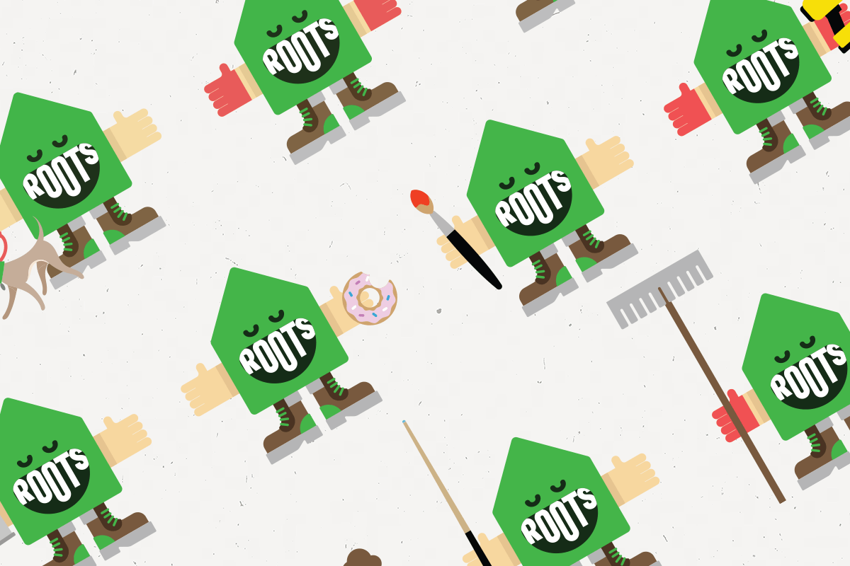
One of my favourite parts of the new brand has to be our character, Roots.
Roots is cute, adaptable and full of personality. You’ll spot him throughout the website in lots of different guises – from Lanzalotty Roots with gardening gloves and a rake, to Builder Roots with a drill in hand.
There’s even Donut Roots, celebrating those well – earned treats after a morning of hard work at the allotment or Binbrook Woods!
Each version is fun, relatable and carefully connected to the work we do. Roots brings the whole brand to life while sending out one very clear message.
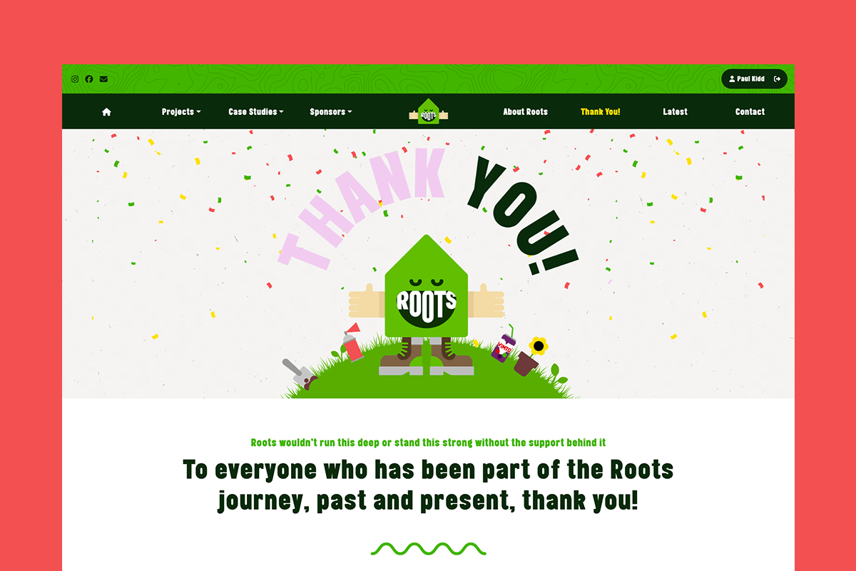
We Are PROUD of Our ROOTS!
This website tells our story so far – but the best chapters are still to come.
Over the coming months, we’ll continue sharing project updates, member stories, case studies and our latest news. We’ll also be shining a spotlight on the incredible people, businesses and organisations who make everything we do possible.
Thank you to everyone who has been part of our journey.
Let’s keep growing together.
We are PROUD of our ROOTS. 🌱
Claire – #RaiseRoots